
Overview
Riverside Park Conservancy, the nonprofit steward of New York City’s iconic Riverside Park, needed a website that felt as alive as the park itself. Their highest priority was a park map that actually worked the way people used it: mobile-first, easy for staff to update, and intuitive enough for a parent with kids in tow to find the nearest playground on the spot.
Beyond the map, the Conservancy wanted a site that loaded quickly, looked modern, and reflected their design sensibilities while still being simple for staff to manage day to day.
Challenge
The old site wasn’t just dated. It created friction at every turn. Pages took too long to load, the navigation confused visitors, and the map—which was supposed to be the site’s main feature—was more frustrating than helpful.
Staff had an even harder time. The page builder was clunky and made even small edits feel like major projects. Behind the scenes, the site was built in a way that forced every page to reload slowly and show a spinning icon before content appeared. That put extra strain on the servers and made the whole experience feel sluggish.
The result: visitors couldn’t find what they needed in the park, and staff were spending more time fixing problems than improving the site.
Strategy
We set three priorities to turn things around:
- Mobile-first design
Most people access a park website while they’re standing in the park. We built the new site for that exact use case. Every page was optimized for speed and clarity on a phone screen. Navigation was simplified so users could get from “where am I?” to “here’s what I need” in just a couple taps. - Interactive, easy-to-update map
The new map became the centerpiece of the redesign. We built a custom, interactive tool that allows the Conservancy to add or edit points of interest without calling in a developer. Visitors can now quickly find dog runs, ballfields, playgrounds, and amenities right from their phones. For staff, making changes is as simple as updating any other piece of content. - Streamlined user experience
We rebuilt the content structure so it feels intuitive whether you’re a first-time visitor or a longtime supporter. The events calendar was improved, donation flows were simplified, and the overall design was refreshed to better match the Conservancy’s brand. The result is a site that feels polished and modern while working exactly the way users expect.
Together, these changes created a site that’s faster, easier to use, and ready to grow with the Conservancy.
The team at E11 are fantastic communicators and reliable thought partners who made our website redesign process easy and fun! They came up with creative and effective solutions to our organization’s unique needs. The team was invested in our success and valued our perspectives – no question was too small. We’re incredibly proud of our beautifully and thoughtfully designed new website, and cannot recommend E11 enough!
– Alison E., Communications Manager
Results
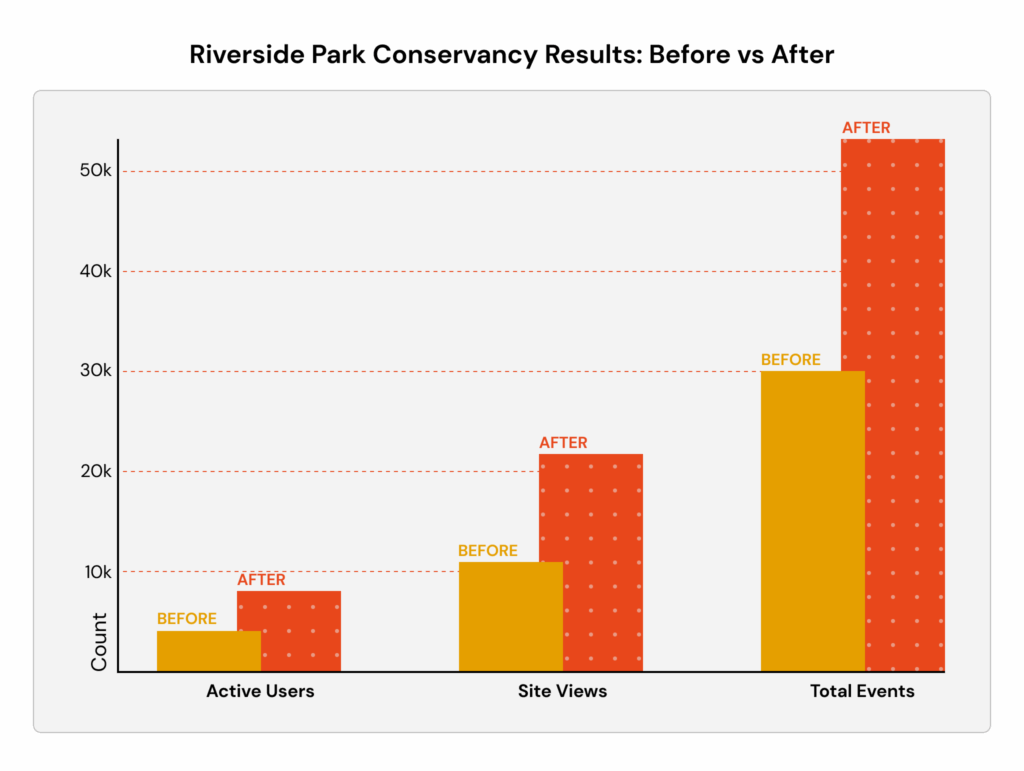
Within weeks of launch, the numbers told the story:
- Active users: 4,100 → 8,100
- Site views: 11,000 → 22,000
- Total events (page views, interactions, engagements): 30,000 → 54,000
- Map views: up 263%
- Events calendar views: up 135%
- Sports camp views: up 120%
- Donation page views: up 61%
The increases weren’t just in traffic. Visitors were staying longer, using the map, checking programs, registering for camps, and donating at higher rates. The Conservancy finally had a site that worked for them and for the people they serve.
Conclusion
Riverside Park Conservancy now has a website that keeps pace with the millions of people who enjoy the park every year. Visitors can find what they need quickly, staff can update content without headaches, and supporters have a smoother path to give back.
For E11 Group, this project wasn’t about “just another redesign.” It was about solving real problems, removing roadblocks, and building a digital experience that matches the vibrancy of the park itself.